浸酒-傳統浸泡酒包裝設計之研究
JinJou-Research on traditional wine packaging design
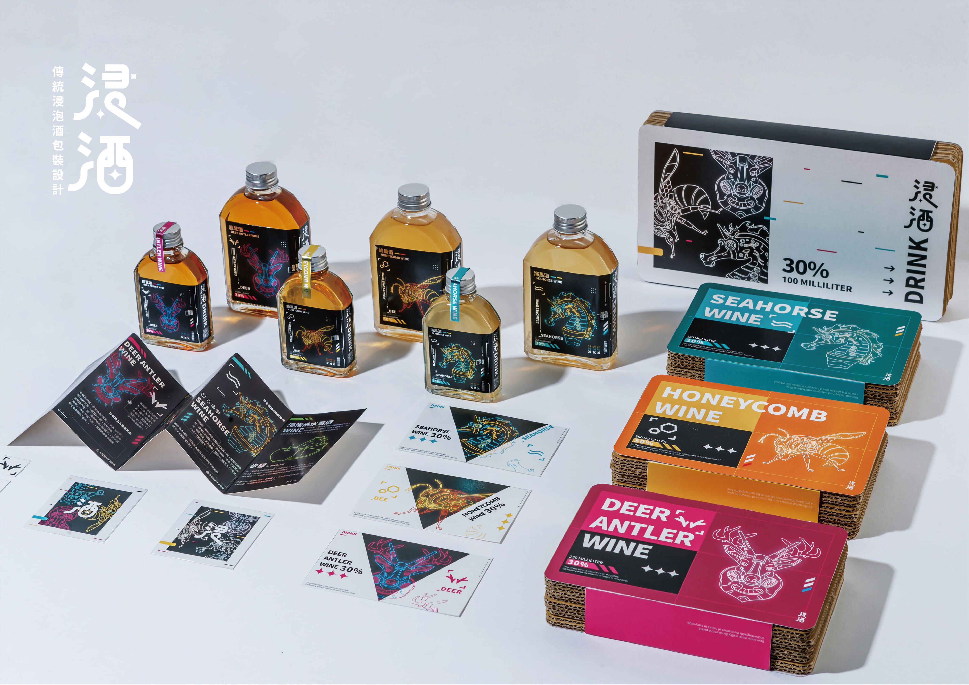
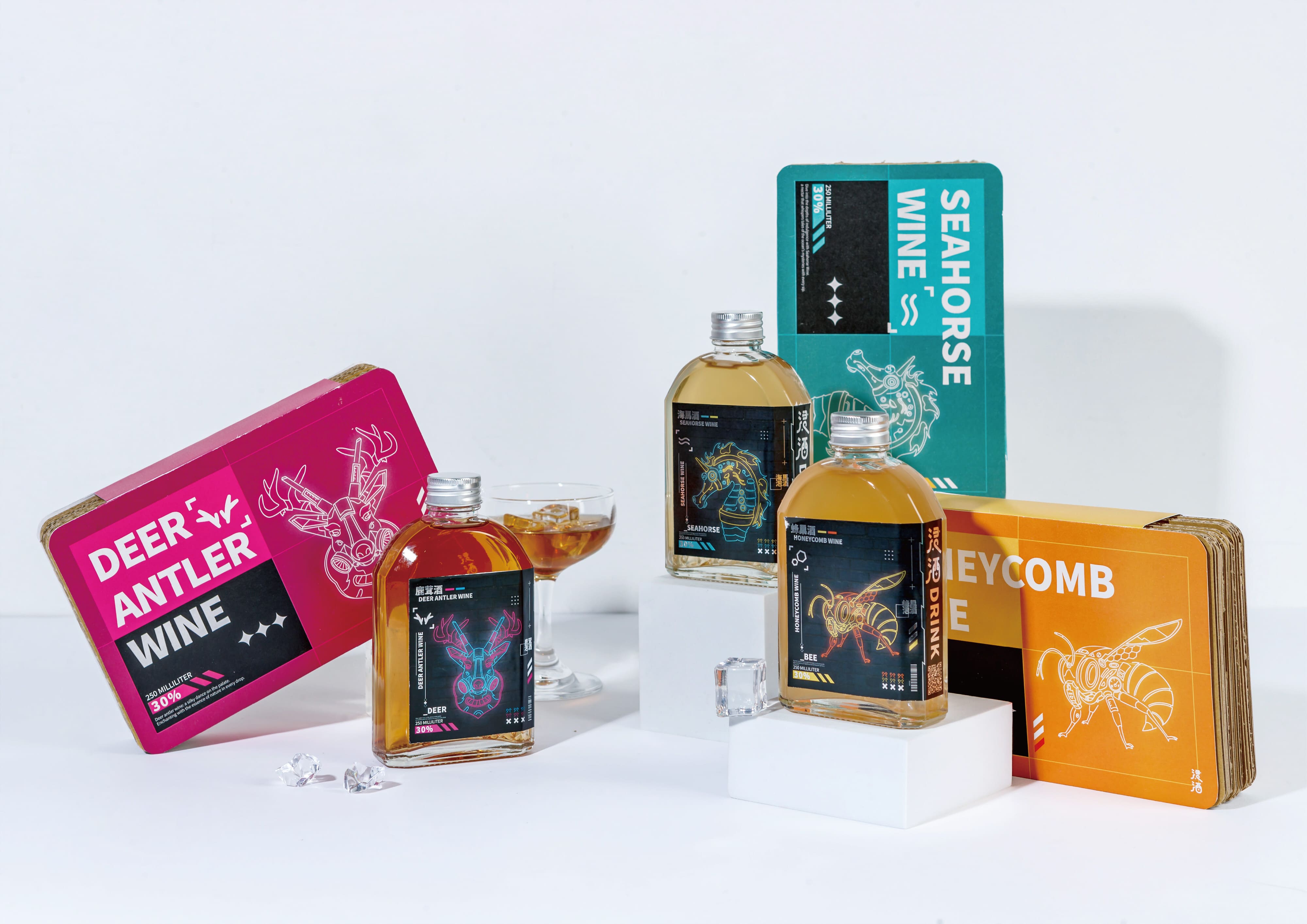
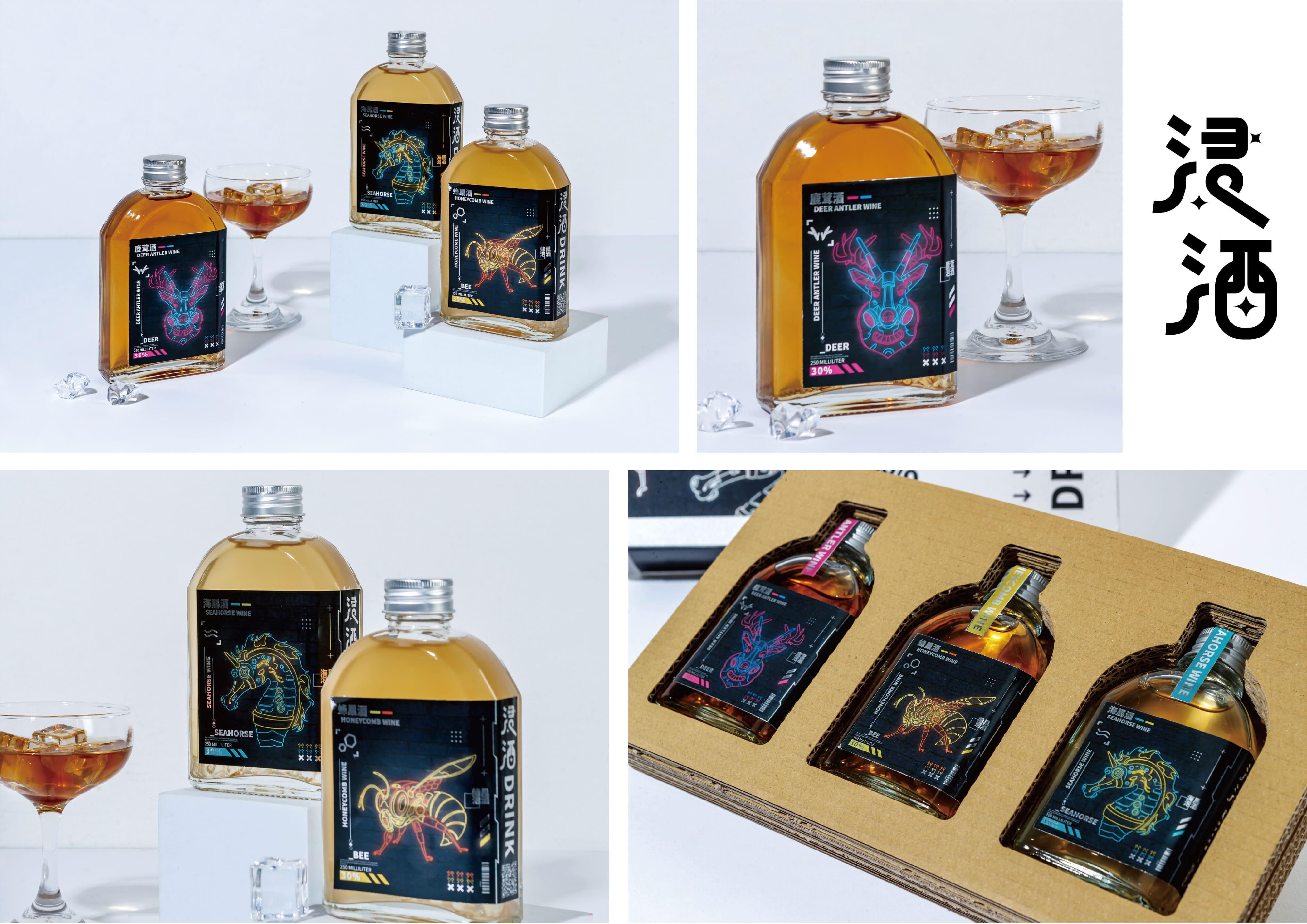
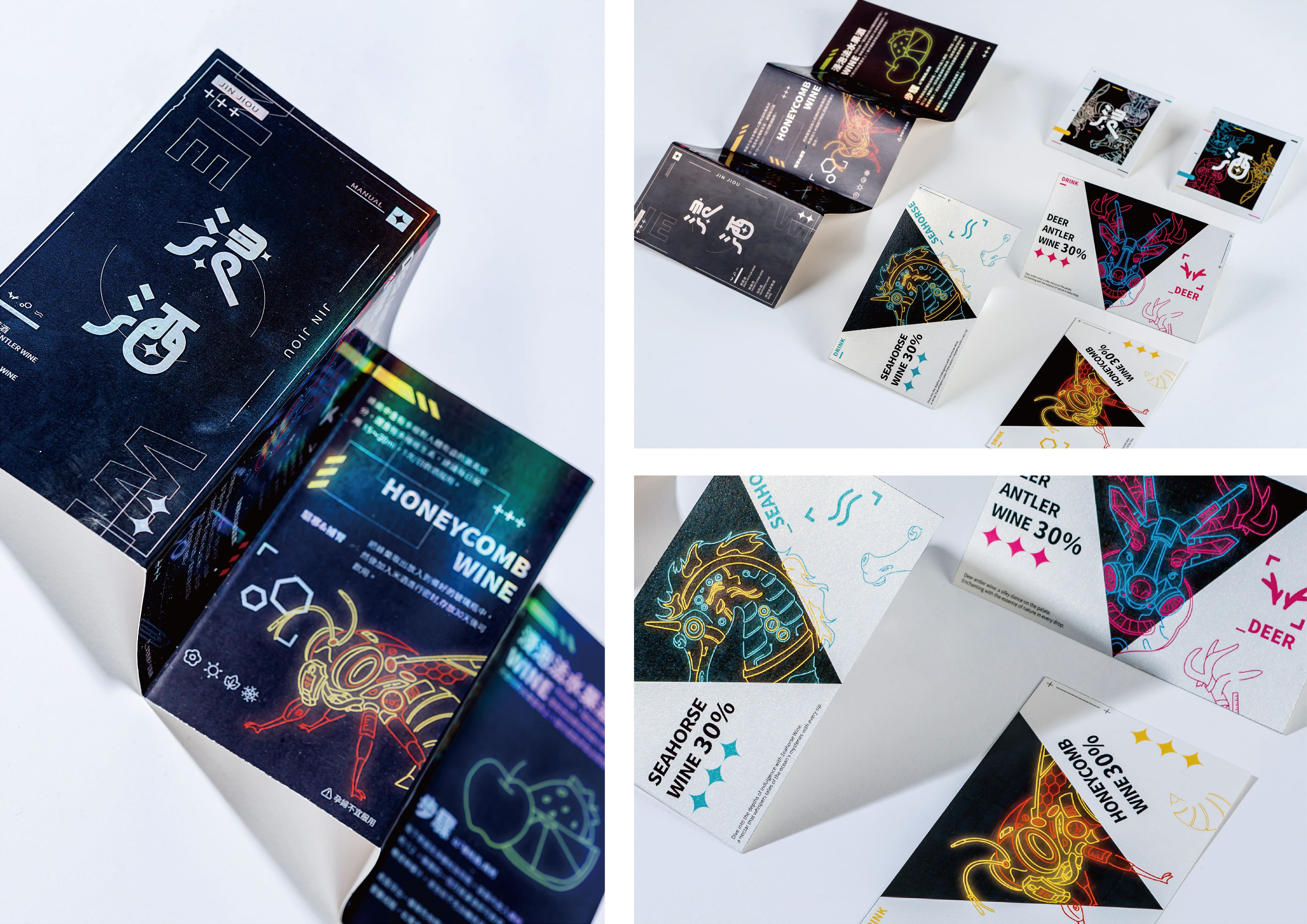
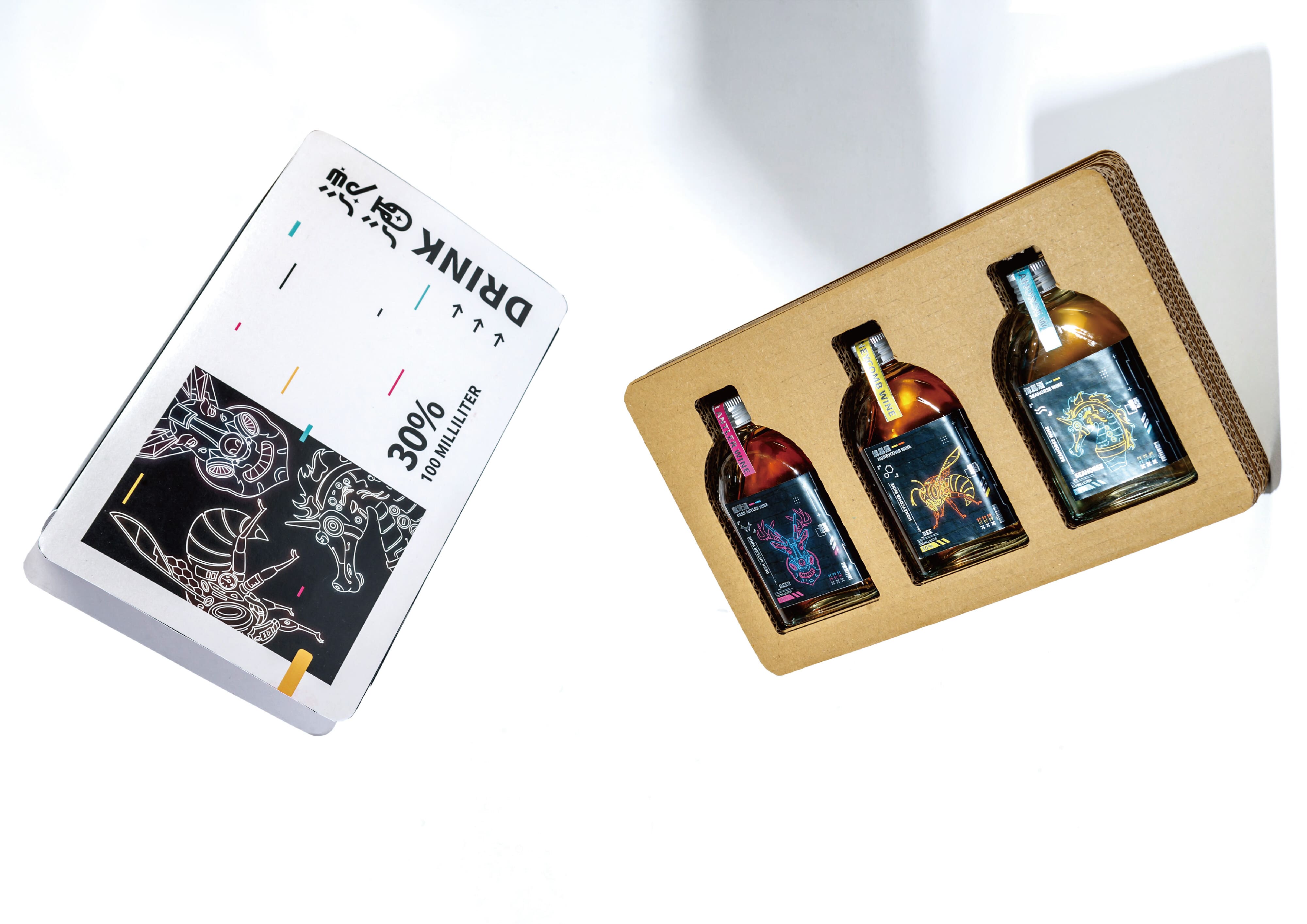
台灣早期流傳著許多種類的浸泡酒,認為透過藥酒能夠強身健體,隨著地區變化各自所流傳下來的配方也都有所不同,具有悠久的歷史,反映了古老中醫藥學傳統。在古時候這類藥酒通常都以大瓶包裝出售,不太著重於外觀設計上,我們從眾多的藥酒中,選擇了較為常見的「鹿茸」、「海馬」、「蜂巢」三種酒去做包裝設計。在視覺設計上我們以霓虹色融合賽博龐克機械風營造酷炫的感覺,參考動物身上的配色,各自挑選適合的霓虹色,鹿茸酒使用桃紅、水藍,蜂巢酒使用金色、橘色,海馬酒則使用藍綠、黃色。顛覆以往浸泡酒給人的傳統形象,賦予創新的視覺,希望能藉此設計吸引到各式人群,讓大家瞭解到原來浸泡酒的外觀也可以很時尚,也能助於保留傳統文化的智慧。
JinJou-Research on traditional wine packaging design
In the early days of Taiwan, many types of soaked wine were circulated. It was believed that medicinal wine could strengthen the body. As the regions changed, the recipes handed down were also different. It has a long history and reflects the ancient traditional Chinese medicine tradition. In ancient times, this type of medicinal wine was usually sold in large bottles, with less emphasis on appearance design. From the many medicinal wines, we selected the more common three types of medicinal wines: "Deer Antler", "Seahorse" and "Honeycomb" for packaging design. In terms of visual design, we combined neon colors with cyberpunk mechanical style to create a cool feeling. We selected suitable neon colors based on the color matching of animals. We used pink and aqua for antler wine, and gold and orange for honeycomb wine. Color, Haima wine uses blue, green and yellow. Subverting the traditional image of soaked wine in the past and giving it an innovative vision, we hope that this design can attract all kinds of people and let everyone understand that the appearance of soaked wine can also be very fashionable, and it can also help preserve the wisdom of traditional culture.
正修科技大學 視覺傳達設計系
(四年級) 指導老師 林雪雰
賴岳興