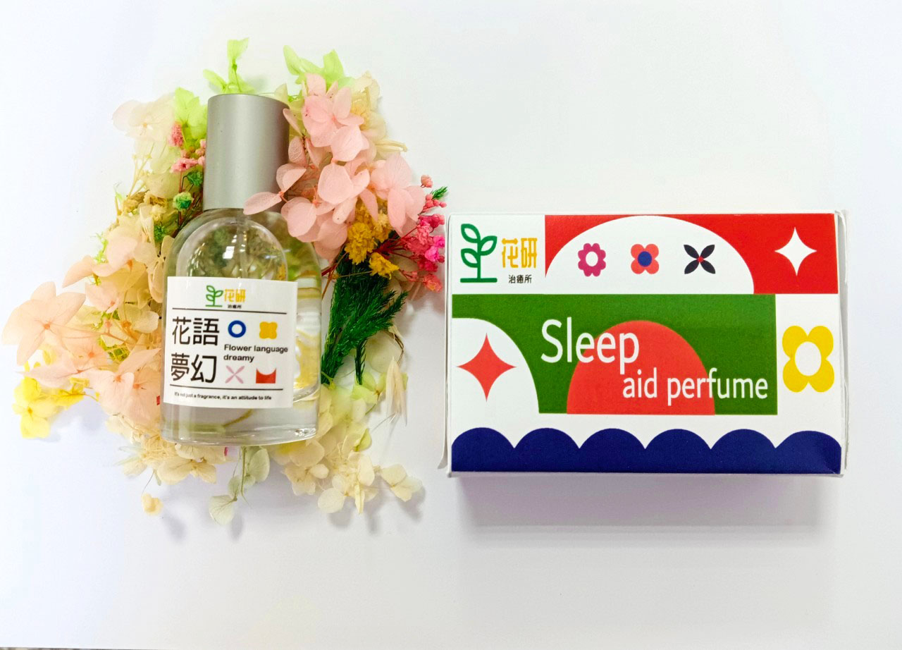
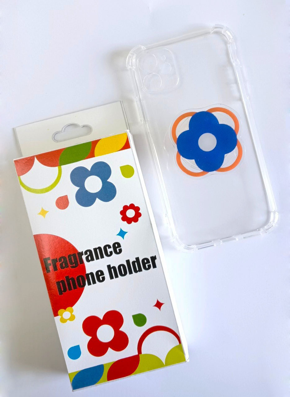
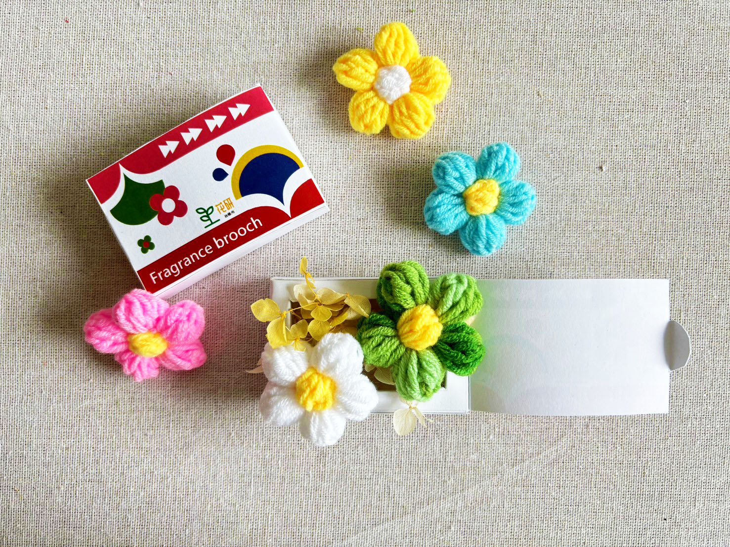
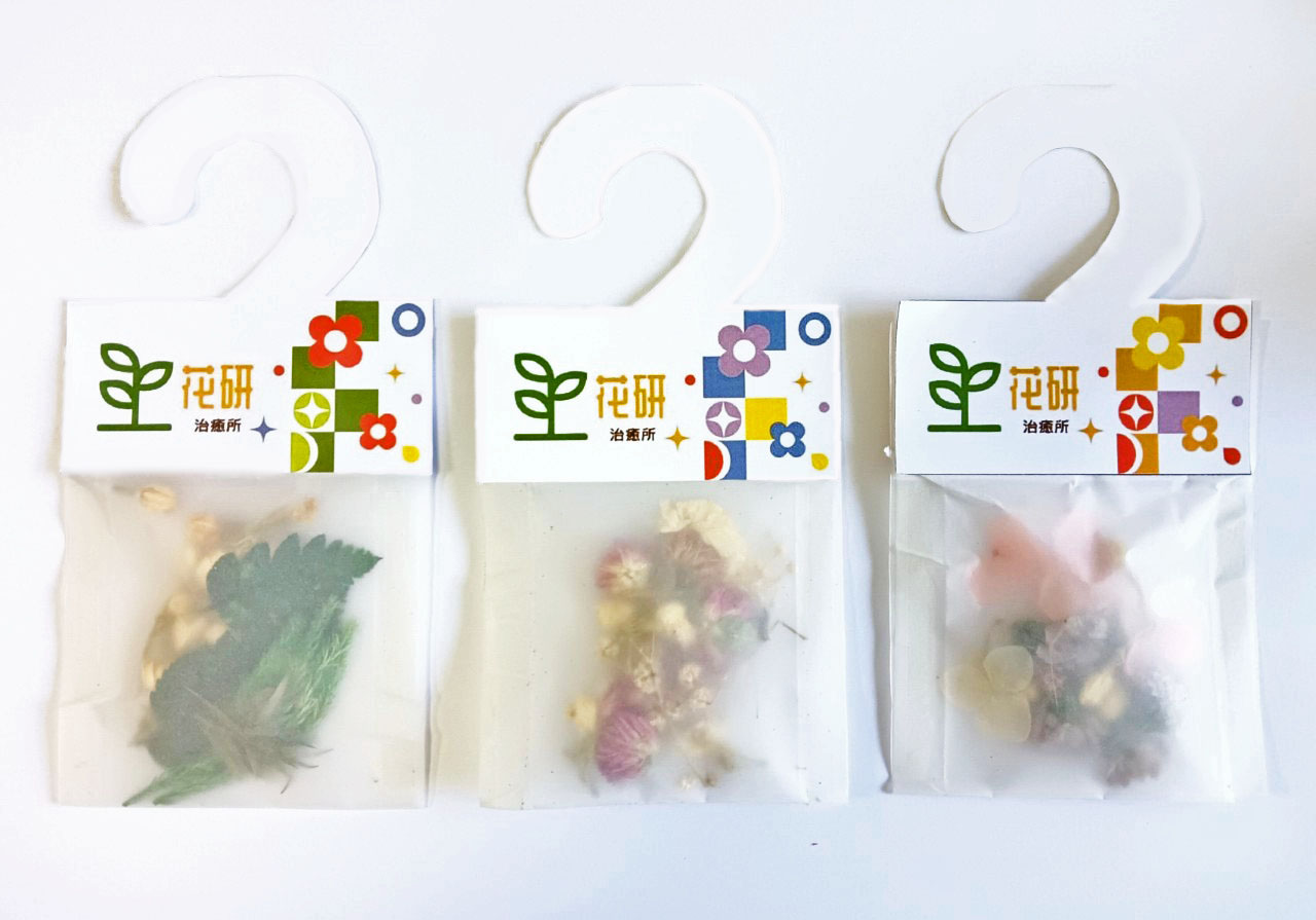
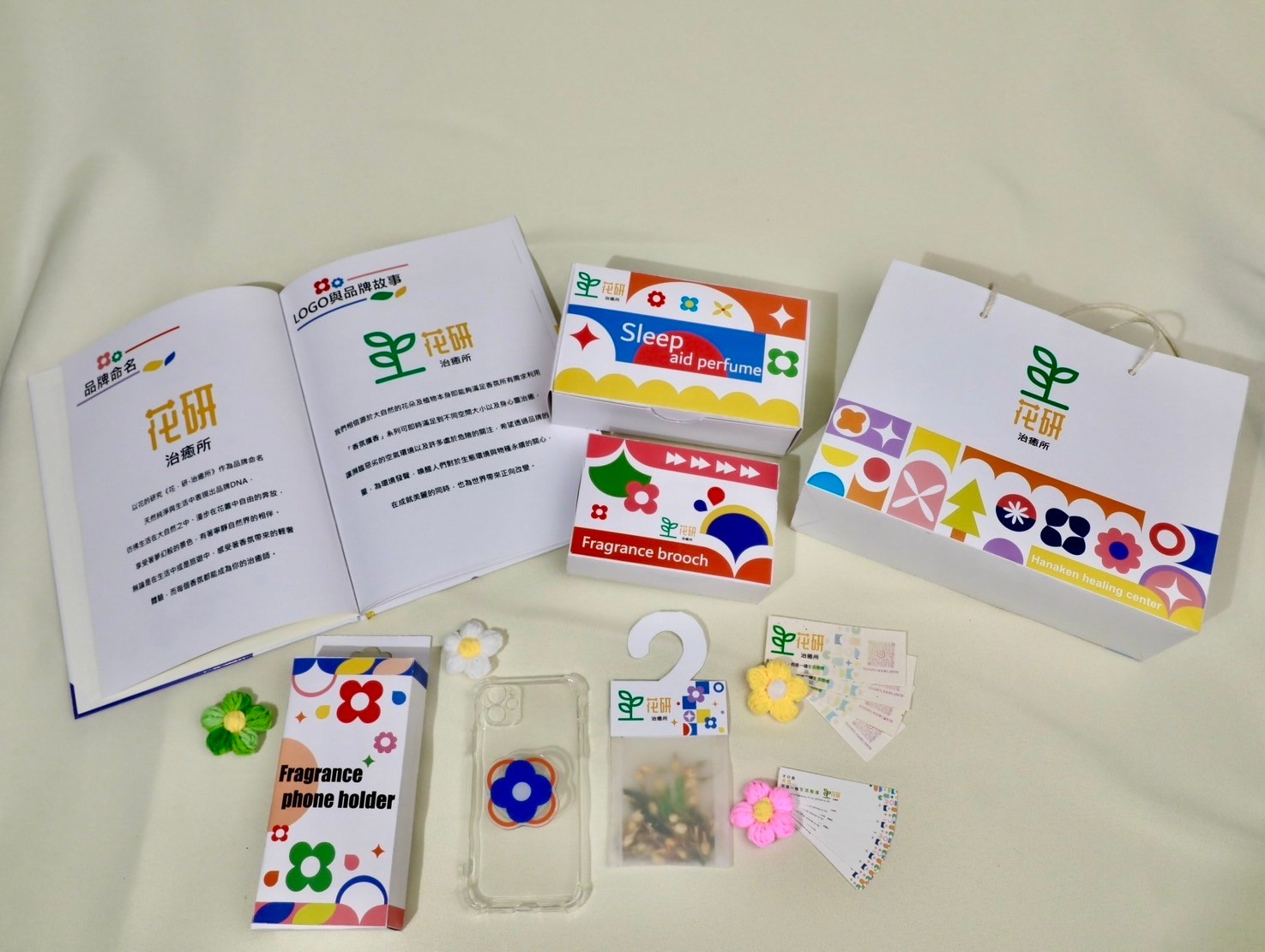
以花的研究《花.研-治癒所》作為品牌命名
天然純淨與生活中表現出品牌DNA,彷彿生活在大自然之中、漫步在花叢中自由的奔放,享受著夢幻般的景色,有著寧靜自然界的相伴。無論是在生活中或是旅遊中,感受著香氛帶來的輕奢體驗,而每個香氛都能成為你的治癒師,專注於以花卉香氛為主的香氛品牌實驗室,為顧客帶來美好的生活體驗和情感連結。生命、清新、希望、活力、熱情的品牌形象,展現出一種生活態度和品味。以白色和亮色為主調的參考顏色,搭配一些綠色、藍色、黃色、橙色、紅色等花卉相關的顏色,傳達出一種清新和活力的氣質。將可持續性納入品牌價値觀及產品開發中,以符合現代消費者對環境保護和香氛產品的關注,並採用可持續的回收材料,推動環保包裝和積極推動森林保護計劃。
Based on the study of flowers, "Flowers. Research Institute of Healing" as the brand name
Natural purity and brand DNA are reflected in life, as if living in nature, walking freely among flowers, enjoying dreamlike scenery, accompanied by the tranquil nature. Whether in life or traveling, feel the light luxury experience brought by fragrance, and each fragrance can become your healer. The fragrance brand laboratory focuses on floral fragrances, providing Customers bring wonderful life experiences and emotional connections. The brand image of life, freshness, hope, vitality and enthusiasm shows an attitude and taste in life. Reference colors with white and bright colors as the main tone, combined with some flower-related colors such as green, blue, yellow, orange, red, etc., convey a fresh and energetic temperament. Incorporate sustainability into brand values and product development to align with modern consumers' concerns about environmental protection and fragrance products, and use sustainable recycled materials to promote environmentally friendly packaging and actively promote forest protection plans.