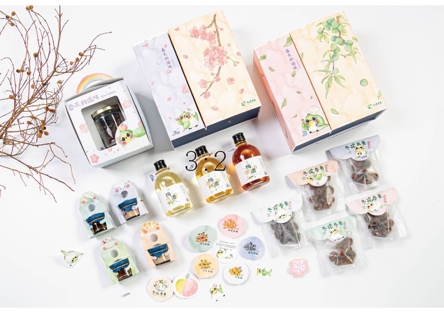
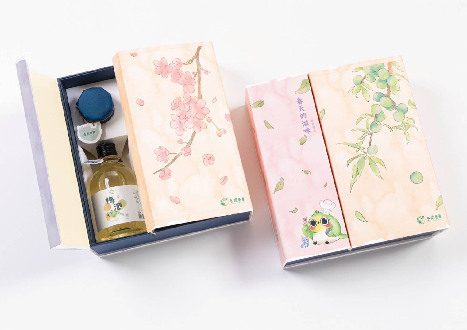
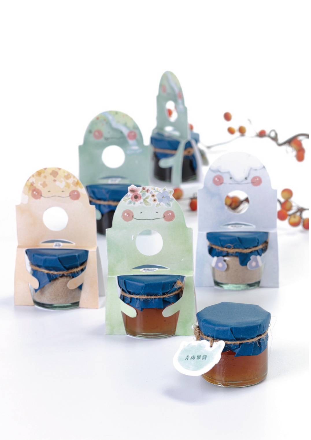
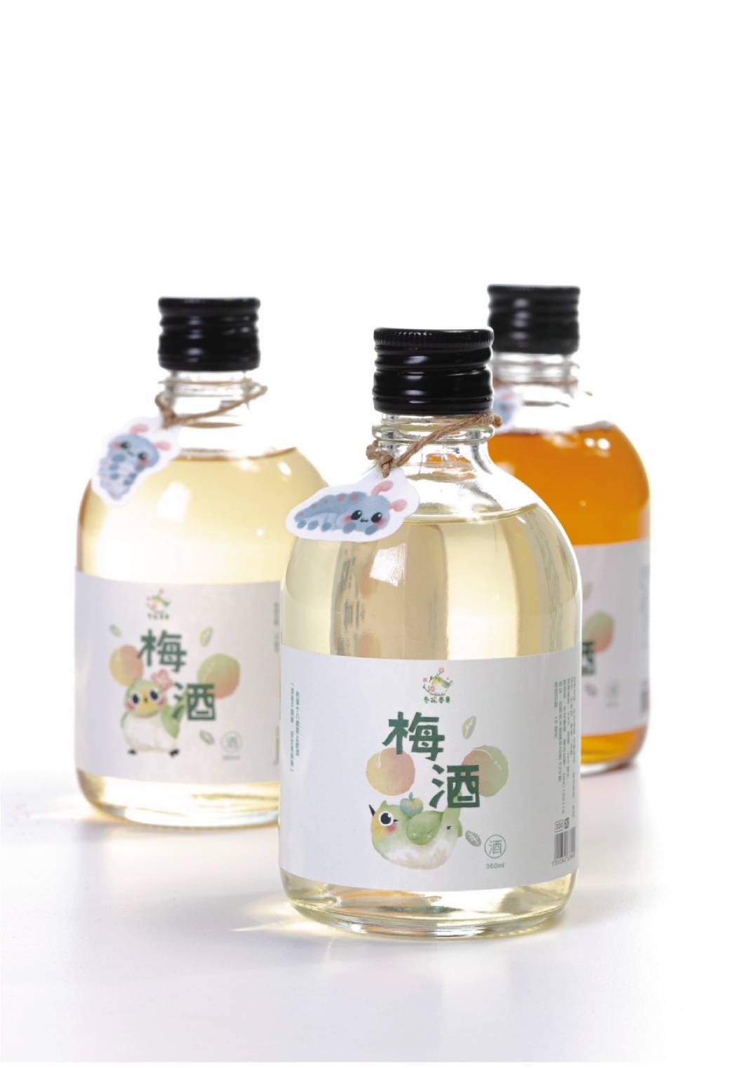
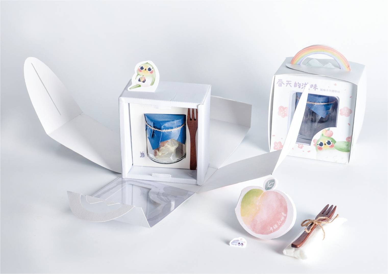
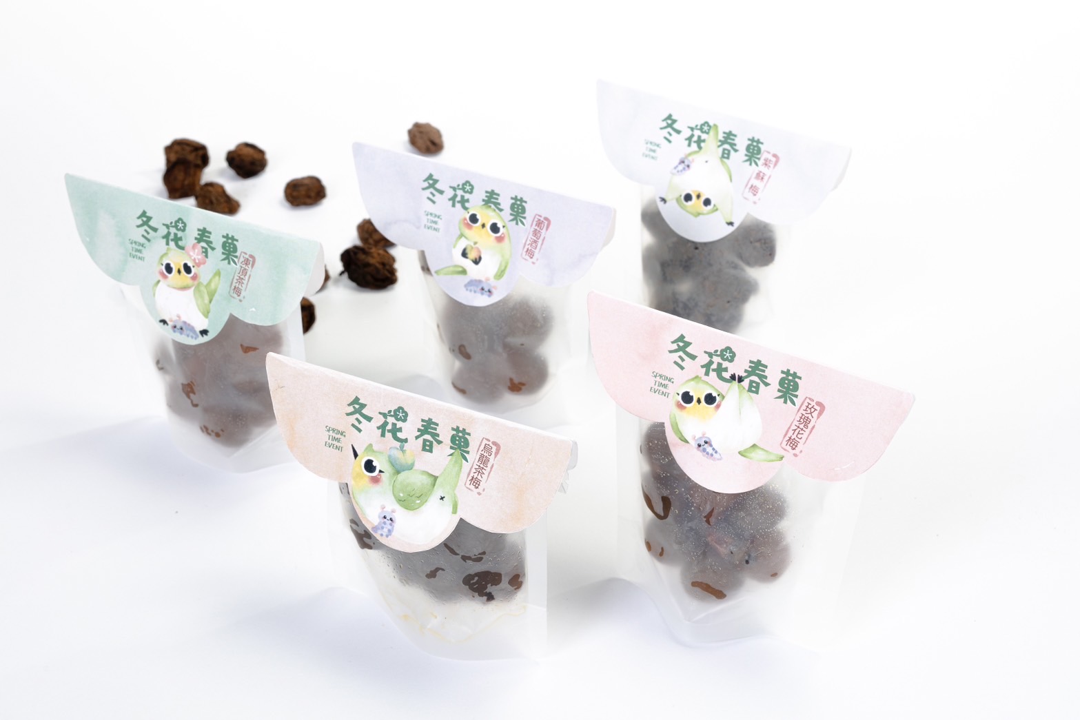
我們風格方式從起初點到總結使用的是插畫風方式,以可愛插畫風格來表現整體視覺,無論是主包裝、吊牌、說明卡等等,統一風格方式,同時也沒有細節上的缺失,包裝上,以方便拿取及其維持與表達內容物作為主要設計目標,外觀更是以我們主方向台南梅嶺去做一個參考,為了讓購買者了解到梅嶺不只是產梅,實際風景也是有特色,設計的不只是單純產品,更是把梅嶺特色傳達給所有人。
Our stylistic approach from inception to conclusion utilizes an illustration style, employing cute and appealing illustrations for a cohesive visual presentation. This consistency is applied across the main packaging, hangtags, instructional cards…etc. The style maintains attention to detail, ensuring a unified aesthetic. In terms of packaging, the primary design goal is user-friendly and the effective representation of the contents. The exterior design is influenced by our main reference, Meiling in Tainan. The aim is to convey not only the product but also the distinctive features of Meiling. It is designed not just as a product but as a representation of Meiling's unique characteristics, ensuring that buyers understand that Meiling is more than just the origin of plums, but also a place with distinctive scenery.